Exterior Level Maps Design Rationale
I decided to make his post as a means to go into my rationale when drafting and designing the exterior sectors of level maps. The exteriors were probably the most enjoyable parts of designing, as here I could design them with a sense of space and flow in some areas.
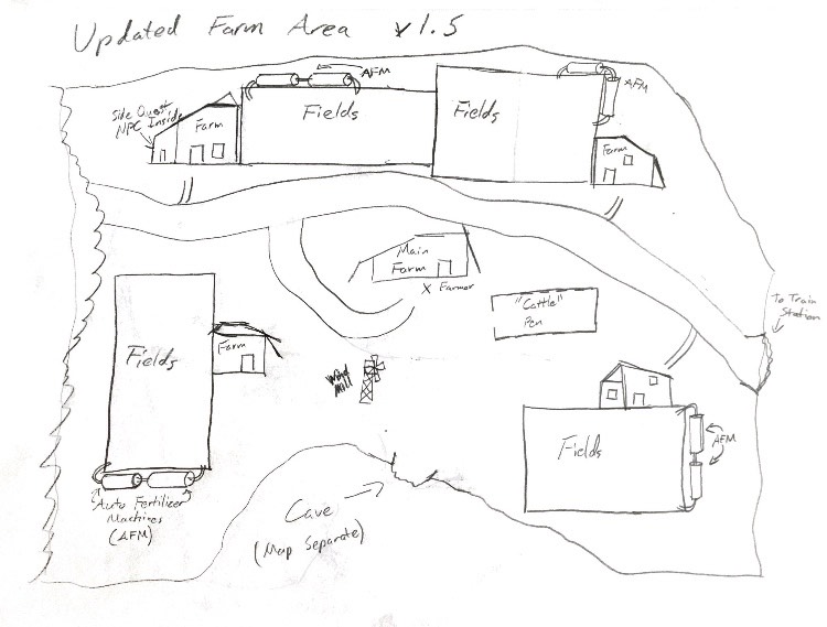
The farm zone (this is a more game-accurate map, made later in development) was the first zone drafted and fleshed out. The general layout was not changed, but the bottom area was adjusted to allow a small caves system The fields placement also went through major adjustments in order to make the area more densely packed and close some awkward distances found in the original draft of the zone. The main pathway was unchanged, as well as the main farm building remaining the center of the map for importance. This was one of the more difficult exteriors I needed to design because of the sheer amount of space the player can freely explore in this zone, and I needed the placements not to seem too haphazard or too claustrophobic. The next map that I designed was for the Residential area.
 ]
]
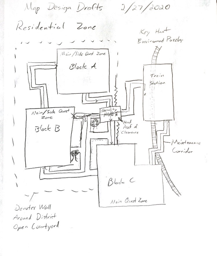
This was the original concept for the layout of the Residential area, and the only notable changes I made (said changes happened over a month later) where the shapes of the A, B, and C blocks of the zone, which lost the strictly rectangular shapes from this map, into more angular or diagonal designs, each having a more discernible look. This map was nice to make and was the first one where I experimented with more complex pathways between the individual buildings, as well as including the "flow" of the events with the line from building to building. However, that was dropped as the story and script received some changes, although the "Block B" building was still visited first. The pathways were designed in a way that gave off a more delegated, planned infrastructure, while also being just overly branching for a means of slight confusion. This was also the first map where I started to get more detailed in descriptions for some details, such as the dotted wall and maintenance corridor. The third exterior map created was for the Factory Zone, a personal favorite even though many details in it have since been cut.
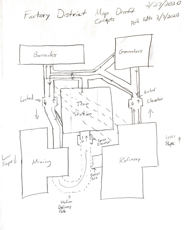
The Factory's basic layout was designed immediately after Residential, and I would add some minor tweaks and changes here and there, mainly for the paths and how they connected. The original idea was to have it be multi-layered, which is why there are elevators labeled on the map, as well as the Station Delivery path being an early concept to link the Mines area to this one. The only changes made to the map were the names of the buildings, in order to facilitate script alterations. This map, while looking simple, was initially designed to be more technically complex in terms of both technical design and quest design. My original idea was to have each building be visited at least once before being given access to the Mining building to move on, the only zone aside from the Heart area where this would truly apply, but that area was far smaller in scale. In terms of full level surface area, this would have been the largest, only able to hold that claim as the original mines map was so large that I needed multiple pieces of paper to even map it out. Speaking of Mines...
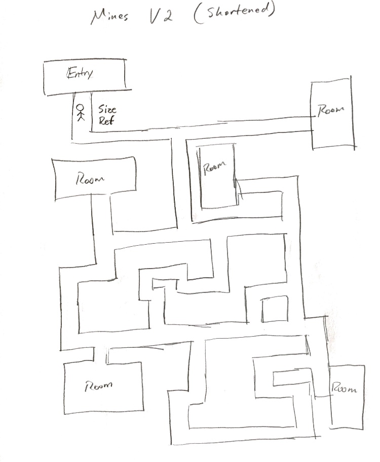
The mines shown above are a heavily truncated version due to both the difficulty of the initial map and the shortening development time we had left. However, I am happy with this ultimate result despite that. This is the simplest map in the entire game, designed as a labyrinthine puzzle where the player needs to simply explore, find the objective, then return to the Factory to leave. The map shown here is about one third the size of the initial plan, and much less complex. The initial draft included layered pathways, sudden dead ends, and some doors that opened as shortcuts (a la Metroid-vania style), but it became too large and would have been too much work to implement, leading to this map. The player can explore as they see fit, encountering enemies here and there. Small puzzles in the rooms were an early idea, but also had to be dropped due to time constraints. The final version here is much more basic and streamlined, although still decently complex. Then there is the smallest map in terms of surface area, the Heart zone...
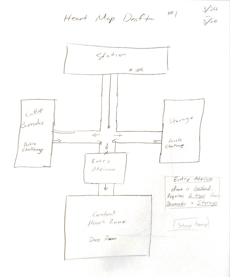
This map is the smallest by design, as it is home to some major combat encounters and narrative points. Because of this, I wanted a simpler, straightforward layout to direct the player in four directions so as not to have them get lost and needlessly explore. The left and right wings needed to be visited before gaining access to the bottom area, and had one combat and puzzle challenge each so as to build up the last area. This map was a quick draft up, but I wasn't satisfied with it for a while and made tiny adjustments here and there. Nothing noticeable in the image, but things like the room names and purposes, as well as some of the room pathways (I experimented with more curved paths but dropped that idea and kept it as is).
That was my general thoughts and rationale for the layouts for the exterior sectors of the game's levels. Due to time constraints and over-complexity of some zones, not everything will be shown in the final game, but I hope this was at least moderately interesting to see some of the original intentions and setups for the maps.
Leave a comment
Log in with itch.io to leave a comment.