HUD / Mini-Map
Dev Log for the Week of 3/30
As System Designer I have been working on various UI designs and organizations. This past week we continued to work on our first-playable version of the game, my role this week was to finish designs for the mini map and implement it into the project.

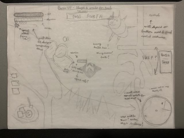
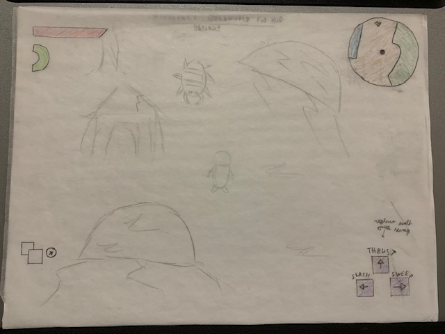
Alongside the mini map in the bottom corner are preliminary designs for the HUD, though it has gone trough several changes through the semester.

In this example I took some inspiration from LoZ: Minish Cap with having various attack types and their matching button inputs displayed on bottom right of the screen. We will not be using this as we’ve gone in a different direction of using different attack types.

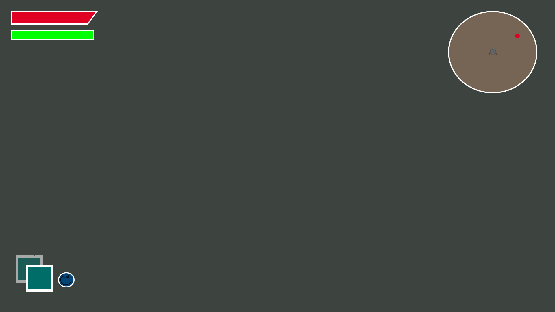
Here is a closer version of what the final HUD will eventually look like. Currently in the project files the mini-map is a one to one of the zone map. In the future I will change some objects to be represented with icons like the player and items, and perhaps a filter to add some sort of blur effect maybe implemented to the mini-map to differentiate it more. Though more testing is required before I come to a solid conclusion on this.
Signing off for now, this has been Liam Ollive,
Hope to see you next week for another Dev Log entry 😉
Get Fallen Worlds (2020)
Fallen Worlds (2020)
| Status | Canceled |
| Publisher | |
| Authors | Precipice Games, EdSpaged, mstorm72, nszpiro, Lee Russo, PrestonDeMarco, JohnPMonzo, DevinD1198, MatthewHanright, Daniel Zale, KJCostello, LiamRingwood, ashleighmiquelle, LiamOllive |
| Genre | Action |
| Tags | 2D, Action-Adventure, Action RPG, Atmospheric, Fast-Paced, Isometric, Meaningful Choices, Open World, Sci-fi, Story Rich |
| Languages | English |
| Accessibility | Subtitles |
More posts
- Balance the elementsMay 14, 2020
- Loot the roomMay 14, 2020
- DashingMay 14, 2020
- Pre-Alpha Build Releasing Tomorrow!May 14, 2020
- Broken HeartMay 14, 2020
- ParasiteMay 12, 2020
- Final Animation AssetsMay 12, 2020
- Brainstorming New EnemiesMay 12, 2020
- Color TheoryMay 11, 2020
- Interior Level Maps Rationale (Pt. 2)May 11, 2020
Leave a comment
Log in with itch.io to leave a comment.