Matt McL - Dev Log #2

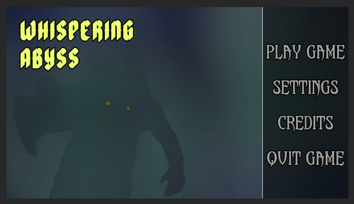
For this sprint, I was given feedback based on the initial main menu design and created a few more iterations of the main menu these iterations can be seen in the links below:
I maintained the idea that the menus should feel uniquely different from the other 1000s of games that utilize center-oriented menus or even right-oriented menus which are used slightly less. In the end, the team decided on Choice 4, due to its use of vertical stacking.
For the next sprint, I'll be working on the level design of the game as discussed with the design team and will potentially be looking into more ideas for the main menu UI. As Design, in general, is an iterative process, I think it's necessary to constantly update these menus with new ideas and concepts until we fully decide on a solid look for said menus.
Get Whispering Abyss (2022)
Whispering Abyss (2022)
Top-down Lovecraftian Horror With a Profuseness of Items
| Status | In development |
| Publisher | |
| Authors | Precipice Games, Nathan Raia, Phardware, Gerald_M, MiLordBeaste, ericklatshaw, CipherStilleto, 2sad4war, SirPrincePerson, K-Tzortzis, Nezuyaki, AndrewMallach, MattMcL1221, ryanjw34, JoeSchmo29 |
| Genre | Adventure, Action, Shooter |
| Tags | Action-Adventure, Dungeon Crawler, Female Protagonist, Horror, Procedural Generation, Roguelike, rouge-lite, Singleplayer |
| Languages | English |
More posts
- Matt McL - Dev Log #8 - 6/03/2022Jun 04, 2022
- Paul Harden DevLog #9 - 4/26/22May 19, 2022
- CarlIsaac Nicolas - Devlog #9May 16, 2022
- CarlIsaac Nicolas - Devlog #8May 16, 2022
- CarlIsaac Nicolas - Devlog #7May 16, 2022
- CarlIsaac Nicolas - Devlog #6May 16, 2022
- CarlIsaac Nicolas - Devlog #5May 16, 2022
- CarlIsaac Nicolas - Devlog #4 - 3/8/2022May 16, 2022

Leave a comment
Log in with itch.io to leave a comment.